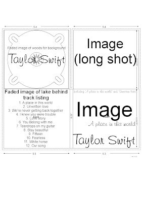
Digipak layout 1: This layout is my favourite because of the large image centered on the front cover. On this layout the image would be a close up of the artist due to it being the most successful camera shot to promote the artist. The artist's name will be big and bold to ensure the audience know exactly who the album belongs to by just looking at it quickly on the shelf. I have chosen to include another image of the artist on the back of the cover to promote the artist even more, but this time it will be a faded image so that it doesn't take the attention away from the tracklisting. I felt it was important to include the tracklisting because when videoing my target market responses they said they would like a digipak to include the tracklisting. Tracklisting is a good feature for a digipak because if the audience like a particular song from the artist then they can easily see if the album includes that particular song and therefore decide whether they would like to buy it or not.
Digipak layout 2:
Layout 2: Within this layout, I have again chosen to include a close up of the artist in order to promote the artist. The wooded area inside the digipak also links in with the main location which is going to be used in my music promo. For the back of the digipak I could have an image of a flower which has been edited to the vintage style which I am hoping to achieve. I think the flower will symbolise the femininty of my artist and that innocent artist who is performing it because this is the feeling I get from listening to the original version of 'A place in this world'
Digipak layout 3:
Layout 3: This layout differs from the other layouts, in that there is no image of the artist on the front/back of the album cover. I feel this is a unique style and may make my album stand out from the other albums, however there is a risk that it won't promote the artist as much as it would if an image of the artist was used.
Poster layout 1:
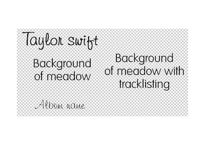
Layout 1: This poster includes the fonts which I feel would look good on the poster. The background of this poster will be a background of a meadow with a vintage style effect to link in with the vintage style music video which I would like to come across within my music promo. I then thought I could have a long shot of my artist at the side of the poster facing forward but not neccessarily looking at the camera.Ideally, I would like a sunrise or sunset in the background to make the artist into a silohette style so that you cannot clearly see the artist. However I haven't decided definatley that I will do this as it may not promote the artist very well if the audience can't see her face clearly. I will include quotes from music magazines at the bottom of the page to make it look like an advert.
Poster layout 2:
Layout 2: This layout involves the quotes from the magazines at the top of the page with each one being a slightly smaller font than the one above to make it look like its filtering into the main part of the page- the image of the artist. I feel the image of the artist looking directly at the camera will help promote the artist further because the audience can empathise with the artist. It will also make the poster more personal to them and therefore may potentially feel like they are the only ones that the artist is aiming at.
Poster layout 3:
Layout 3: I like the idea of having the artist positioned at the side of the poster so that the audience still know who the poster is about. One of my ideas is that I could out an effect on the artist and just make her silohette like in the distance with the sun shining through the trees in the wooded background.