Thursday, 25 October 2012
Mrs D
This is a good first drfat Danielle. Well done for hitting your deadline. The lip syncing is impressive. You need to concider how you are promoting your artist - more close ups are needed. You also need to think about the different threds that you are using and how the locations work i.e. one location for present (Woods) and other locations to suggest flashbacks. Go back to RMAs to help you.
Wednesday, 24 October 2012
First draft editing reflection
Within the editing process, I started off looking at the different transitions I could use to make the video flow better and move from each location/scene in a smooth and professional way. I knew what I was looking for from the beginning- I didn't want anything too bold or too young looking because it needs to appeal to a young adult audience. I used a number of transitions such as cross dissolves, additive dissolves, dip to colour dissolves and different image effects such as black and white. I felt these editing effects were appropriate for my video because it linked in with the style I wanted to achieve and made the video have a completed and professional look.
However I did have the issue that in some areas of my music video, I did not film enough footage before and after the part that I needed, meaning that it was difficult to add a transition in for it. However I overcame this problem by choosing other suitable transitions which fitted. If I still have this problem when I come to do my second draft, I may have to think about filming some parts again.
Overall I felt this was a very successful process because it made my music video look polished.
Tuesday, 23 October 2012
Digipak drafts

 |
| Draft 1: I really like the image on the front cover here. The medium close up promotes the artist well and the fact that she is looking directly at the camera, makes the audience feel like she is directly addressing them making it more personal to them. I feel the scripted, handwriting font fits with Taylor Swift's girly style. I like how the artist is positioned to the right on the back cover because the lyrics look well positioned and they are not covering up the artist as they would if she was positioned in the middle of the frame. I may think about changing the font on my back cover to the same font used on my front cover to show continuity. The left inside image does not work well because the audience will not be able to see her face and therefore will not promote her properley. However, the right inside image works well because the guitar fits in with the instrumental parts of the song which is why I have chosen to use this particular prop. Also I like how her body is slightly dark with the background being lighter because it makes her stand out more and the audience can see her straight away. She is positioned well in the centre of the frame with the lyrics to the side of her. To balance this out more, I may choose an image which has the artist on the right side instead of in the centre. Overall I feel this is a successful draft because the same locations provide continuity and ensures the artist know that it is all from the same artist from the same album. |
 |
| Draft 2: This draft has the same front cover image as the other drafts but I have looked at a different font for 'Taylor Swift'. The back image is also different and I like the unique idea of what she is doing in this photo. However I feel that this image doesn't go as well with the front image as the other image with her standing against the tree. The image on the left inside with her looking down works quite well but I may choose one where she is looking at the camera, in order to promote her more. |
 |
| Draft 3: This draft includes a different font for the front cover. I am not sure on using this font because it doesn't fit with the style I am trying to get across. |
 |
| Draft 4: This draft includes a more script font. I'm unsure on the font used here because I feel it is hard to read in some places, especially when it is smaller on the back cover. |
 |
| Draft 5: This draft is one of my favourites. The font is perfect for the style I am trying to get across and the outline effect makes it stand out even more. I need to ensure that the brightness' for the front and back cover are the same. I may also think about changing her outfit of location for the inside, or just changing the effects on the images I have taken in order to make the inside look slightly different but not too different. |

Monday, 22 October 2012
First draft filming reflection
Unfortunatley I did not begin filming on the 16th October due to my main actor not being available. Instead I re-scheduled to film on Friday the 19th October. Due to nearly all of the video being set outside, I could not film on this day due to the weather conditions. I filmed what I could inside but could not complete all of the filming. This issue was frustrating because I knew I had to meet my deadline on Thursday 25th October. After these problems I ensured that I made a time where both me and my actor are available. Monday 22nd October I filmed the rest of my music video. I made sure that I filmed each particular part 5- 10 times so that I would have enough footage to choose the best from. It was also good to do this, incase my actor made a slight mistake which I wouldn't of picked up on from just watching her. I can then use the other footage without these mistakes.
Whilst filming the inside part of my music video, I felt it went successful. I found a suitable location where my actor was sitting on the window sill with a large window in the background which is what I wanted. The only factor which was less successful was that the camera had a slight tilt to it which made it hard to get it straight. I tried to hold it so that it was straight, however did not want it to jog due to me touching it.
After this, filming in the woods was again very successful. For the first part of the video where I said there would be a close up of the actor singing, I found that it worked better if I started off with the close up then zoomed out so that the audience could see the road that she was walking down, in order to link with the lyrics in this first verse. For the chorus, I felt that it would work better if I had a slightly different area of the woods and got my actor to do something different than she would in the rest of the song. I used the pathway with the wooded area on each side and got her to walk down the pathway towards the camera until she reached a medium close up position. I felt this distance shot would work well as it differs from the other parts of the video which is good because it is the chorus. For the instrumental parts of the song I have chosen to film my actor playing a guitar because it fits with the instrumental tune in the song and also goes with the country- pop theme which I am trying to achieve. On my storyboard I said there would be a part set by a lake. I didn't change this, but I did change the camera angle because I felt it looked better. Instead of a medium close up used with the lake in the background, I used a long shot with the actor walking towards the lake whilst looking at the camera and then looking out at the lake with her back to the camera. I felt this was very effective due to her raising her arm for the bit where she sings 'fly'.
Overall I felt that the filming for my first draft went very successful. The main aim which I wanted is to link visuals with the lyrics, which I felt I achieved in this draft. I also wanted to ensure that the lip syncing was in time and that it looked profession (e.g. no smiling or laughing during filming.) I feel that all of my aims have been achieved and am very pleased with how this filming process has gone.
Tuesday, 16 October 2012
Dolby
Danielle, The posters are nice- I think that the mise-en-scene works well for the artist and it does use the key ingredients- font suits artist well. Consider the size of font relating to the importnace of the information.
Could you include the artist to promote her? Also, could you display more ICT skill by integrating text and image more effectively?
Mrs D
I have just had a look at your storyboard and it has lots of potential. It has some good shots and promotes the artist well with mid shots and CUs. I would have a bit more variation of these in terms of location. You need a few movement shots too - not just zoom. Some of the fades work - although there is a positive moment and you fade to black - not sure that works. Look at how your RMAs end to help you. There is also a lyric about walking down a street at the beginnning - would it be good to include this as a location to vary it a little?
Monday, 15 October 2012
Magazine Advert Drafts

Draft 1: This is my first draft of my poster and I feel it is quite successful. My favourite feature is the slightly edited background which makes it look 'vintage' and has a warm feel to it. The font of 'Taylor Swift' and 'A place in this world' is a soft/script font but is still modern looking. I feel this style goes with the theme I am trying to show in my music promo and ancillary task. I have chosen to only do two quotes at the bottom of the page because it looked to crammed if I had 3 quotes. The font for the date is in a slightly bolder and larger font than the rest of the text to emphasise one of the most important parts of the poster. Overall I feel this is a succesfull first draft but my only worry would be that it may not be promoting the artist as well as it could as I have not used an image of her. However I feel it still is a successful poster without the artist but I will do other drafts with the artist involved so I can see which I prefer.
Target market response: 'I love the edited style of the image because I think that it fits in well with the country- pop genre. The font used for Taylor Swift fits in perfectly with the theme which you are trying to achieve. I like how you have used different fonts for different parts of the poster. I would like to see an image of the artist on the poster though so that the audience can see straight away from glancing at the poster, who it is about.

Draft 2: This is the same as my first draft apart from the date which is different. I like both styles of the release date which is why I have uploaded both drafts for it.
Target market response: I feel having the date in numbers rather than written out, is more clear. However I feel that it looks like a film date rather than a release of a music video date.

Target Market response: The best thing about this draft is the image. I like how she is quite close up but can still see her whole body and that she is directly looking at the camera. However I don't like the layout of all the endorsements because it looks a bit confusing and unclear. I think it would b better for you to line them up and put them under one another.

Target market response: I like the photo of the long road however I feel the colour of the writing doesn't really go with the rest of the poster. Also the artist isn't centered within the middle of the poster. However I like the large date in numbers rather than written out fully because I feel it draws more attention to the poster because it is more punchy. Overall the image is successful but the text is not integrated very well with the image.
Thursday, 11 October 2012
How research and planning has helped my construction
How
will research inform my planning?
How will planning inform my construction?
How will planning inform my construction?
Wednesday, 10 October 2012
Potential Images for Ancillary Task
This is where I have taken some images of my artist and some location images without the artist in it. I feel this wooded area is a good location because it is quiet and peacful which will hopefully reflect within my music promo. I have taken some images of the artist which I could use either within my digipak or on my ancillary poster. I am also going to take photos in other locations which I will show in the contruction stage. I have taken a variety of close ups and long shots. In some of the photos, it shows my actor to be at either the right of left side of the frame. This is because I may use these ones for the back cover of my digipak so the tracklisting can go on the side next to the image so it is clear and easy to read. The following pictures have been taken in Simone's wood and in my actor's house:


I also took a couple of photos at Chaucher woods:


Calendar


This calendar helps me to see how long I have for each section of my project and therefore helps me to organise my time. I have colour co-ordinated the calendar to make it clearer for me and so I can see which section is which. As you can see, I have used pink for the planning stage, navy blue for the deadlines, light blue for the ancillary task, orange for filming, green for editing promo and red for the days where I should be working on my final ancillary and muisc promo. I will begin with starting the ancillary task on the 12th October and then the music promo filming on Tuesday16th October, and then edit it and ensure I can hand in my first draft of the music promo on the 22nd October. I will then continue with my ancillary task. Whilst still working on the task I have to ensure that I am filming and editing constantly so I can meet the second deadline for my music promo second draft. I then have to ensure that my final music promo and final ancillary task is completed by the 29th November.
Tuesday, 9 October 2012
Storyboard

Monday, 8 October 2012
Taylor Swift Research
Through my planning stage I realised that it would be important for me to find out more information about Taylor Swift because she is the artist who sings the song I am using for my music promo. I wanted to try and find out how many people listen to Taylor Swift, who the main people are who listen to her and how popular she actually is.


This is print screen from twittercounter.com which shows how many people follow someone, mostly used for celebrities. The graph shows how much Taylor's followers increase each day. I feel this was an important image to include because it shows how many people actually like Taylor Swift enough to follow her on Twitter.

I also decided to look at Taylor Swift's official webpage. The first feature you see when you first go on the artist's website is the large image of her and the word 'red'. This image promotes herself so the audience know straight away that they are on the correct artist's website. The red writing and theme of the webpage links to the name of new album. There are many options to 'download on iTunes' which will take you to the iTunes store so that fans have the opportunity to purchase the album. There are many other links for social networking sites such as Twitter and Facebook where the fans can 'vote for Taylor'. There is a section which has been written by Taylor Swift called 'My Life' so that fans can understand who she is and what how she has grown up. The website is full of plenty of images of the artist in order to promote her and therefore her music. The website includes lots of useful statistics such as: "Taylor, who writes all of her own songs, has career record sales in excess of 22 million albums and 50 million song downloads. Each of her three studio albums has sold in excess of 5 million copies worldwide, and her most recent album, Speak Now, is one of only 17 albums in the entire history of music to sell more than 1 million copies in a single week. She has had singles top both the country and pop radio charts around the globe, is one of the top 5-selling digital music artists worldwide, and is the top-selling digital artist in country music history." This information shows how good an artist she actually is and puts into words how many people enjoy her music and listen to her.

This graph shows how popular each of her songs are. This graph again emphasises how many people listen to her songs and albums.
Friday, 5 October 2012
Letter to Cast
This is the letter which I sent to my cast, asking for their permission to be in my music video:
Dear Cast members,
I would like for you to take part in my music video for my A2 media coursework. The main singer will have to sing whilst I will be filming you and you will have a particular outfit/make- up to wear which I will confirm with you before we begin to film. The main artist will have to be available for taking individual images for my digipak task.
Other members in the background of my music video, I will discuss what outfits you can wear before we start filming.
Thankyou for your time and hope you can be involved in my music video. Please sign below if you give your permission to be filmed for my courswork:
Thanks again,
Danielle
Thursday, 4 October 2012
Moodboard

Overall I think I am most leaning towards the use of the vintage style images for my music video because this is the style I can imagine my actress and song to be like. Once I have chosen a style for the music video I have to ensure that my digipak has the same style so that it looks like it is from the same artist and the audience know straight away that the digipak goes with the song. The audience may also be able to associate the specific style with the artist in the future.
Monday, 1 October 2012

Digipak Layouts
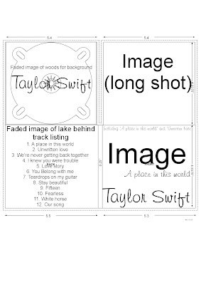
Digipak layout 1: This layout is my favourite because of the large image centered on the front cover. On this layout the image would be a close up of the artist due to it being the most successful camera shot to promote the artist. The artist's name will be big and bold to ensure the audience know exactly who the album belongs to by just looking at it quickly on the shelf. I have chosen to include another image of the artist on the back of the cover to promote the artist even more, but this time it will be a faded image so that it doesn't take the attention away from the tracklisting. I felt it was important to include the tracklisting because when videoing my target market responses they said they would like a digipak to include the tracklisting. Tracklisting is a good feature for a digipak because if the audience like a particular song from the artist then they can easily see if the album includes that particular song and therefore decide whether they would like to buy it or not.
Digipak layout 2:


Layout 2: Within this layout, I have again chosen to include a close up of the artist in order to promote the artist. The wooded area inside the digipak also links in with the main location which is going to be used in my music promo. For the back of the digipak I could have an image of a flower which has been edited to the vintage style which I am hoping to achieve. I think the flower will symbolise the femininty of my artist and that innocent artist who is performing it because this is the feeling I get from listening to the original version of 'A place in this world'
Digipak layout 3:

Layout 3: This layout differs from the other layouts, in that there is no image of the artist on the front/back of the album cover. I feel this is a unique style and may make my album stand out from the other albums, however there is a risk that it won't promote the artist as much as it would if an image of the artist was used.
Poster layout 1:

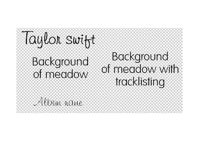
Layout 1: This poster includes the fonts which I feel would look good on the poster. The background of this poster will be a background of a meadow with a vintage style effect to link in with the vintage style music video which I would like to come across within my music promo. I then thought I could have a long shot of my artist at the side of the poster facing forward but not neccessarily looking at the camera.Ideally, I would like a sunrise or sunset in the background to make the artist into a silohette style so that you cannot clearly see the artist. However I haven't decided definatley that I will do this as it may not promote the artist very well if the audience can't see her face clearly. I will include quotes from music magazines at the bottom of the page to make it look like an advert.
Poster layout 2:

Layout 2: This layout involves the quotes from the magazines at the top of the page with each one being a slightly smaller font than the one above to make it look like its filtering into the main part of the page- the image of the artist. I feel the image of the artist looking directly at the camera will help promote the artist further because the audience can empathise with the artist. It will also make the poster more personal to them and therefore may potentially feel like they are the only ones that the artist is aiming at.
Poster layout 3:

Layout 3: I like the idea of having the artist positioned at the side of the poster so that the audience still know who the poster is about. One of my ideas is that I could out an effect on the artist and just make her silohette like in the distance with the sun shining through the trees in the wooded background.
Subscribe to:
Comments (Atom)